
Intro
In the ZURU Tech team, we deeply care about consistency and the importance of a consistent user experience across our product ZURU Home. This article will dive into the process that took us from working on different mockups and assets to our own Design System and we will also show what we achieved, and what will be our next steps.
Our team is working on a new Building Information Modelling (BIM) software powered by Unreal Engine, a game engine, in combination with web technologies. Such technologies have an impact on our design system because the standards and guidelines comprehend both environments.
In order to bring consistency to such a big product, while the design team was transitioning from Adobe XD to Figma, we took the opportunity to think about building our very first Design System and we called it Aurora.
We chose this name as it embodied our ideals. Auroras are optical phenomenons of the Earth's atmosphere, characterised mainly by light bands of a wide range of shapes and colours rapidly changing over time and space. This is what we mean by a Design System, an outstanding experience that changes shape, colour, and meaning over time and space. It changed before, it's changing now and it will change in the future.
In this article, we’ll show you why we built Aurora, our process, and what we achieved since we started.
What is a Design System?
Before we start diving into the importance of having our Design System, it might be useful to explain what exactly we mean by “design System”.
A Design System is a collection of all the aspects that allow teams to develop a digital design including such things as icons, colour pallets and components. It can be considered as the single source of truth that groups all the elements that will allow the teams to design and develop a product. It is not a single deliverable but a set of deliverables that will evolve constantly with the product, tools, and new technologies.
Having a Design System means building a language for the design and development teams they can both speak to improve the product.
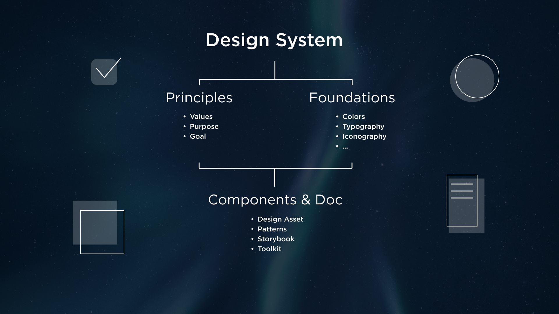
For Aurora, the Design System is mainly made of three layers:
- Foundations, with all the guidelines about the typography, colour palette, grids, spacing rules, and more
- Components, all the design elements such as Figma components built on the guidelines of our foundations
- UI Kit used by our development team where all the components and guidelines are brought to life
At ZURU Tech, we have a design team and two different development teams that work on the UI Kit, one for the online services side (web development), and one for the Unreal Engine side.
Why is a design system important?
Our first step in the creation of Aurora was understanding the problem we were trying to solve:
“Why are we making it?”
This was the most important question that led the team to highlight the following issues:
- There were lots of inconsistencies
- Missing solid foundation of the product
- No guidance on when to use a certain design pattern
These were the main pain points that were confronted with the pros of having a Design System:
- Bring cohesion across the product
- Reduce engineer burden
- Consistency across the product in terms of language, visuals, and interaction
Considering a Design System as a product in itself was very helpful, continually evolving with the company and project directions.
What was our process?
After doing some research about how other big tech companies (such as Apple, Atlassian, Google Material, and more) built their own Design Systems, it was time to start gathering all the assets that each member of the team had been continuously creating and using inside mockups. The design team mapped the entire UI considering all the elements both from the web kit and Unreal Engine kit.
The inconsistencies within components — those that did not reflect the industry standards or were built for specific needs and were not scalable — really stood out.
This was the turning point, the moment we understood the value of the design system and the problem we were going to solve.
We noticed our sources of inspiration divided their Design System into two main parts:
- Foundations, all the guidelines that ensure consistency
- Component library, where the actual reusable components are set
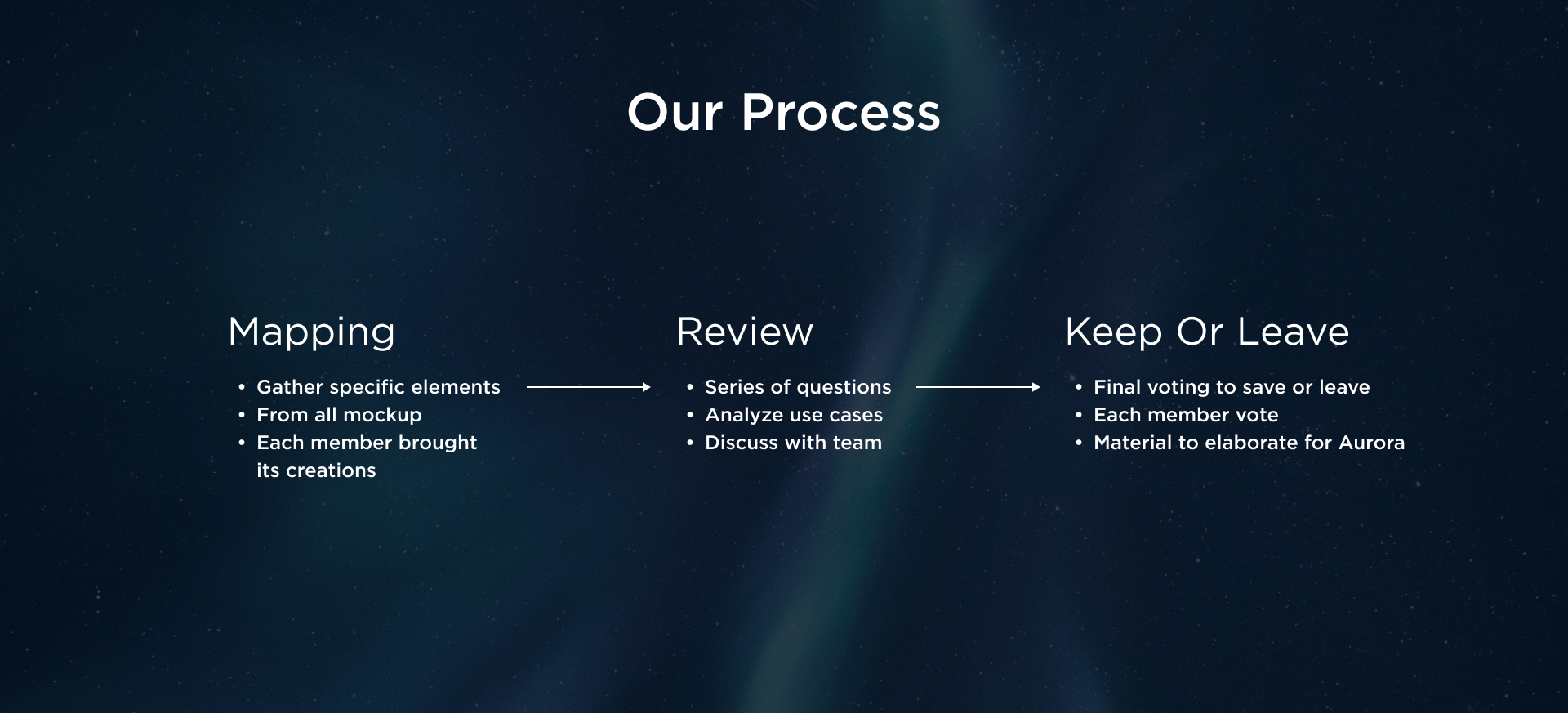
The initial mapping made it easy to divide all topics necessary for foundations and components. This work required the collaboration of the entire design team, this is why we set weekly/bi-weekly meetings to discuss the topics (e.g. buttons, drop-down components, cards, etc.), starting from the smallest.
Each meeting had 3-steps:
- Each member contributed to the meeting by bringing the components they had worked on, which were then presented to the rest of the team.
- Next, we discussed the most critical ones and asked ourselves questions such as:
- Does the component follow the rules of colours and spacing?
- If not, is there a strong use case for this exception?
- Are the different states clearly defined?
- Based on the answers and previous discussion, we could decide what to save and what to discard.
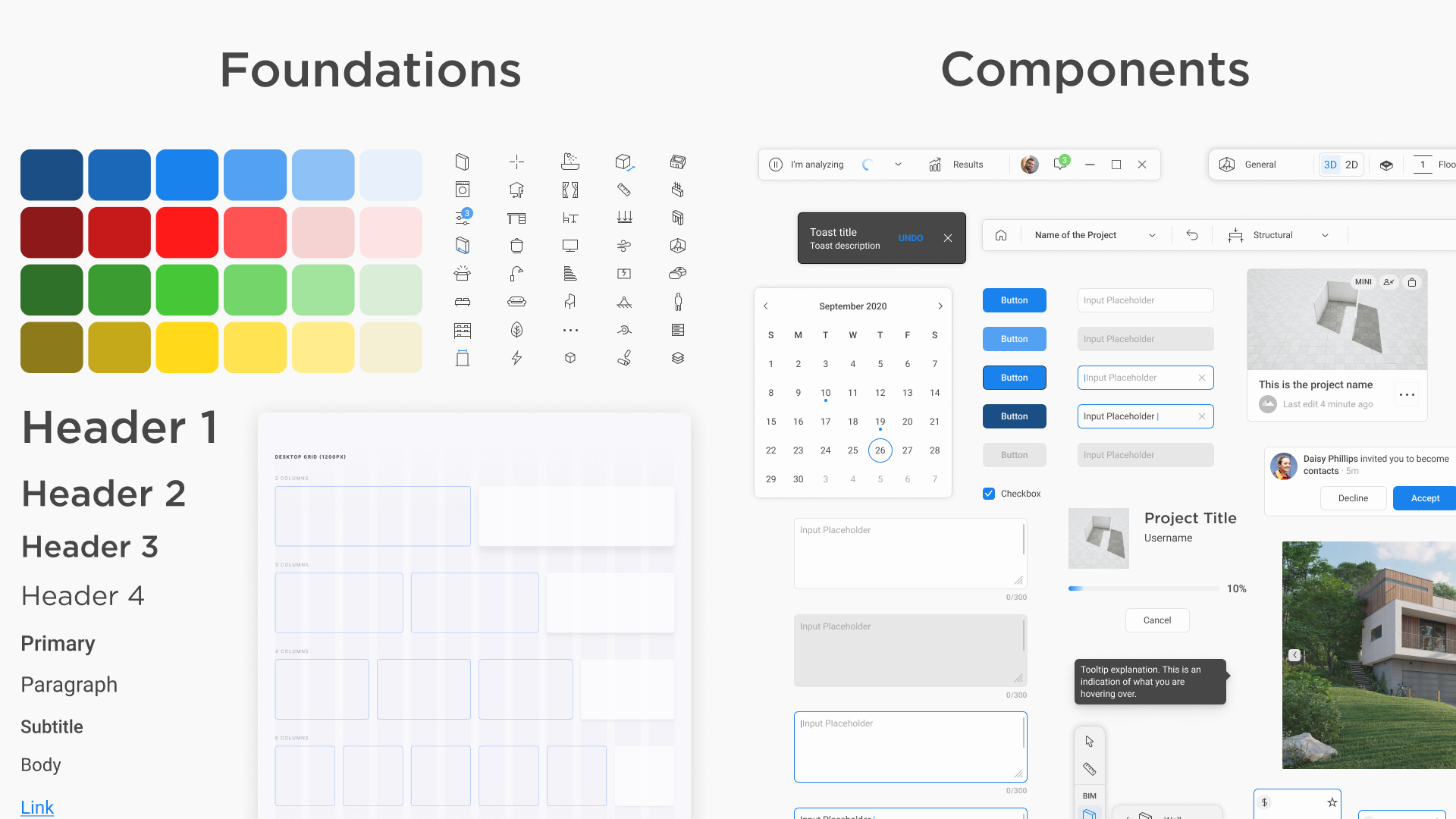
The final outcome consisted of two main parts:
- Documentation on Notion, each component page, for example, has a clear section about when to use it, which are the types and states, and its anatomy
- Design Assets in Figma, each page is dedicated to a type of reusable component and its variants in order to have a more flexible and scalable structure.
Where are we now?
After the workshops and revisions Aurora finally reached the first version, the only thing that was missing was a UI revision.
It was very important for us not only to have flexible components on Figma — ones that respected the guidelines from foundations and that could fit different needs — but also give our components the final look and feel that we wanted.
After research, mood-boards and review with the management team, we finally achieved version 1.0 for Aurora. We can’t wait to show you in the video below!
Zuru_Presentation_of_the_new_UI1.mp4
Thanks to the update of the look, the following updates for the maintenance of the Design System have been more focused on the improvement of documentation (moving from Notion to Storybook), refinements, new component entries, and development support.
That’s a wrap for now
Just like the team at ZURU Tech is continuously growing, so is Aurora. We keep working on our Design System to improve the flexibility and performance of both the design and development teams.
The goal is to make it easier to work with Aurora in general, especially as we are starting to use it across different platforms at ZURU Tech.